Design System Revamp
Contributed to a collaborative effort to modernize a legacy design system, enhancing usability, accessibility, and visual appeal for thousands of clients.
The Challenge
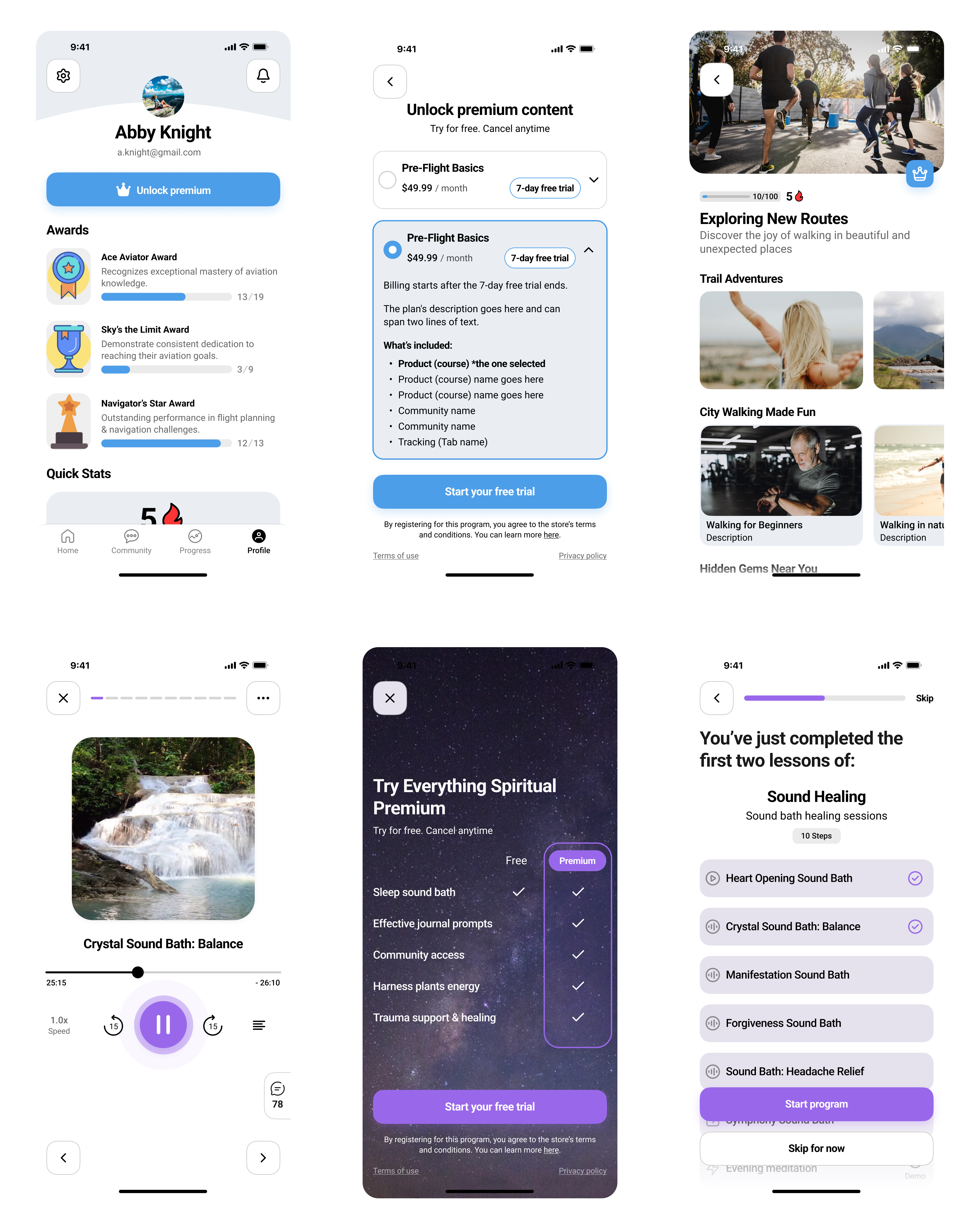
Our platform's user interface was built on a legacy design system that was becoming a significant bottleneck. For developers, building new features was slow and inconsistent. For our clients, the app designs felt dated, with sharp corners, confusing icons, and poor accessibility. Key components, like the audio widget, were unintuitive, hiding essential controls and frustrating users.
"Building a new feature feels like starting from scratch every time. We spend more time fixing inconsistencies than we do innovating."
"The app works, but it looks like it was designed ten years ago. It doesn't reflect the quality of my brand."
The mission was clear: we needed to overhaul the entire system to improve efficiency for our team, deliver a modern and accessible experience for our clients, and build a scalable foundation for the future.
Discovery & Goals
As a key designer on this project, I collaborated with another designer, a PM, and three developers. We began with a comprehensive audit of the existing system and held feedback sessions with both internal teams and clients. This discovery phase helped us define three core goals:
- Modernize the UI: Introduce a contemporary aesthetic with rounded corners, a clear color hierarchy, and a playful new theme to align with our brand evolution.
- Enhance Usability & Accessibility: Redesign core components to be intuitive and meet WCAG 2.1 AA standards, ensuring a better experience for all users.
- Improve Developer Efficiency: Create a robust, well-documented system of reusable components to accelerate the development lifecycle.
Guiding Principles
To ensure our new design system, "Spark," was cohesive and purpose-driven, we established a set of guiding principles. I was instrumental in defining and advocating for these principles throughout the project.
Clarity First
Every component and pattern must be clear, intuitive, and easy to understand, reducing cognitive load for both users and developers.
Playfully Professional
The system should feel modern and engaging, reflecting our brand's personality without sacrificing the professional quality our clients depend on.
Accessible by Default
Accessibility is not an afterthought. All components are built to meet WCAG 2.1 AA standards from the ground up.
User-Obsessed
Every decision is weighed against the impact it will have on our clients and their end-users. We build for them, first and foremost.
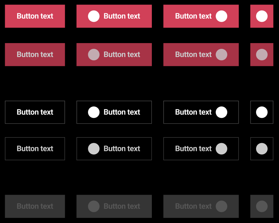
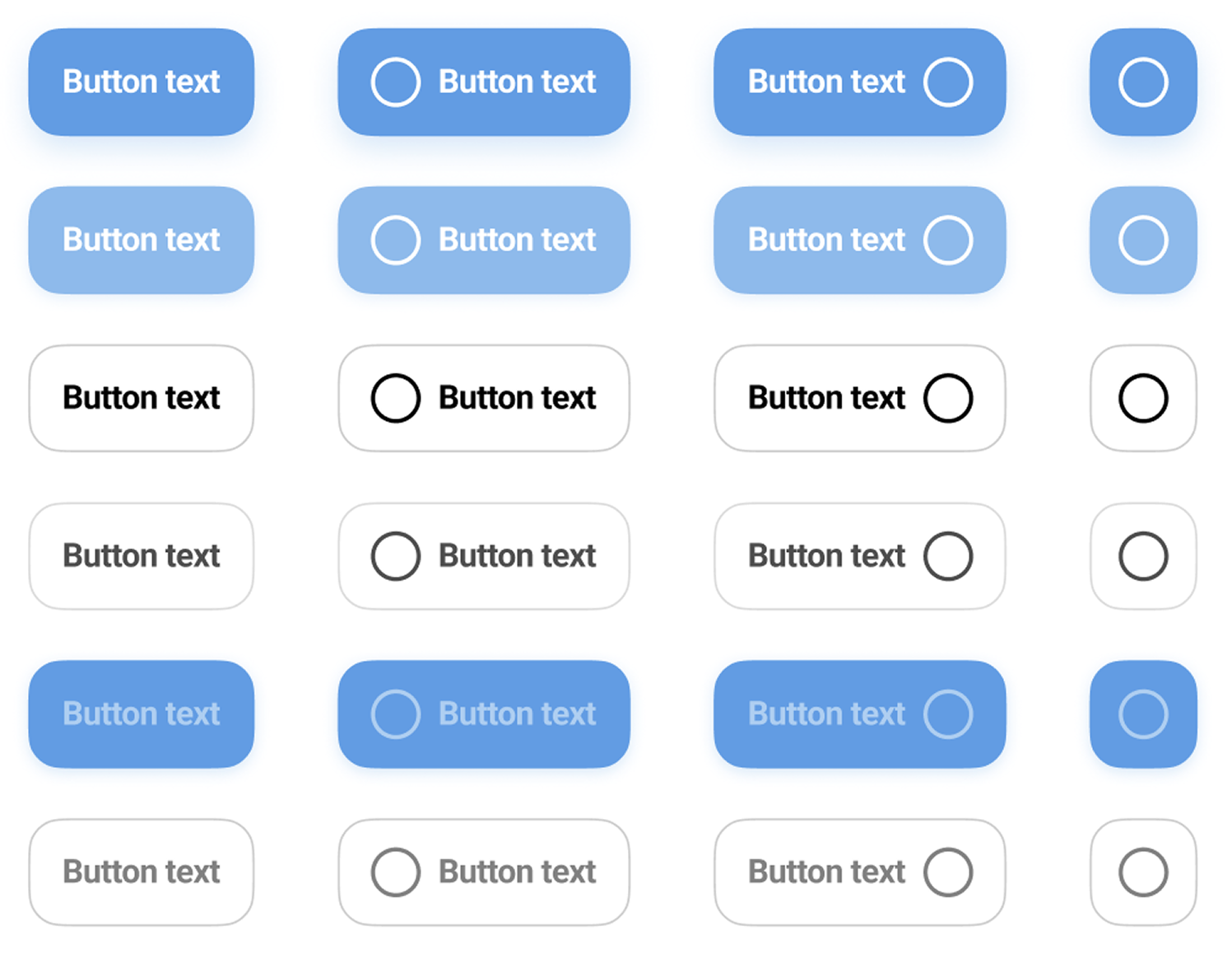
Component Spotlight: Buttons
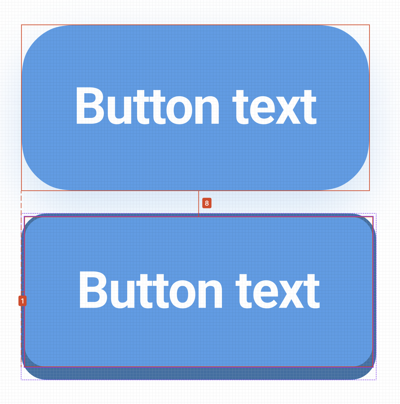
One of the most fundamental yet impactful changes was the redesign of our button components. The original buttons had inconsistent sizing, poor color contrast, and no defined hover or active states, leading to a confusing and inaccessible user experience.
I designed a comprehensive set of button variants—including primary, secondary, and tertiary styles—each with clear, distinct states for hover, focused, and disabled. By creating a component that was both visually appealing and highly functional, we made one of the most common interactions on our platform instantly better.
Impact & Outcomes
The launch of the "Spark" design system was a transformative moment for the company. It was adopted by over 70% of new clients within the first three months and laid the groundwork for future product innovation. The project's success was validated by significant improvements in key metrics:
- 50% Reduction in time for developers to implement new UI features.
- 35% Increase in positive user feedback regarding the app's look and feel.
- Achieved WCAG 2.1 AA accessibility compliance across all core components.
Lessons Learned
Revamping a design system is as much about people as it is about pixels. The biggest lesson was the importance of creating a shared sense of ownership. By involving developers from day one and holding regular feedback sessions with clients, we ensured the system we built was not only beautiful and efficient but also practical and widely adopted.
This project also highlighted the critical need for robust documentation. Our decision to use Storybook as the single source of truth was instrumental in the system's success, ensuring that the bridge between design and development remained strong long after the initial launch.